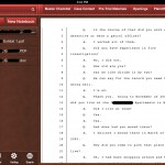
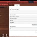
TabLit recently released Trial Notebook ($69.99), an app aimed at making trial preparation easier and more organized for lawyers. The app is a great concept with a good start, but is still a bit rough around the edges and a bit of a learning curve as it took about 2 hours to become familiarized and comfortable working with the app.
Trial Notebook Concept
Any lawyer who has taken more than a few cases to trial is familiar with the concept of a trial notebook. Everything that matters gets placed into the three or two ring binder ‘notebook’ and neatly organized by tabs. Though each lawyer may have their own preferences, the basics in a civil case usually include tabs for: Case Info/Summary; To-Do List; Witnesses; Jury Selection; Jury Instruction; Damages; Exhibits; Pleadings/Orders; Opening; and, Closing.
Making the Trial Notebook Electronic – iPad
The iPad begs to be used as an electronic version of the trial notebook. Transitioning the trial notebook concept to the tablet platform makes perfect sense. TabLit’s approach takes the standard concept of a trial notebook and adds in the features which would be expected of an electronic version, including word search for the entire notebook. In each ‘tab,’ Trial Notebook allows creation of two main types of page: outline mode or checklist mode. In addition there are two other types of page: a ‘document’ based page and a ‘contacts’ based page. The contacts page will pull info from iOS Contacts. However, it is a bit unpolished in use because it doesn’t allow searching or sorting of iOS contacts, making it virtually impossible to locate the contact you want to add to your trial notebook.
Trial Notebook currently allows Dropbox integration in a ‘download’ only mode with no two-way sync. Documents, including images, PDFs, and Word docs all download fine and are viewable in the app. In fact, Trial Notebook was extremely fast and stable while downloading an entire set of folders and subfolders on a complex litigation case that is just weeks shy of a jury trial, including a prior trip up the appellate court ladder. Many other apps have choked and crashed trying to download data this large from Dropbox. PDFs are not indexed even if they have been OCR’d, only text within the app shows up in searches. The app also includes the ability to track the admission of exhibits, i.e. documents are added from the main library to an ‘Evidence’ or ‘Exhibits’ page and they can be check-boxed (customizable). The developers plan to include two-way Dropbox sync as well as PDF annotation in a not-too-distant release. A premium pay-to-use service is also in the work. The service allows staff to collaborate and add items to a notebook via an online interface. Allowing staff to modify and add items through a web-based interface at the office and sync those directly down to the iPad is a good idea for attorneys on the go.
Perhaps the most interesting feature is the ability to pick an item from anywhere else in the notebook and drop it on the page you are currently viewing. So, in use, you could include a reference to an exhibit within a witness examination outline and the reference would also pull the checkboxes for admitted/denied. At that point in the examination, after moving admission, you could then check the appropriate box and the check would also be reflected on the main exhibit list page. Checklist items (for example for elements of proof) could be used in the same fashion. Additionally, tapping the hyperlink will jump you directly to the referenced item. Unfortunately, there is no plan to allow presentation of the exhibit via an AppleTV or VGA adapter cable. Also, beware: there is no ‘back’ button or recent item navigation so it may make it hard to find your way back to the examination outline in the middle of trial.
Text formatting on the outline pages is a bit odd, with icons that are pixelated and reminiscent of Word ’95. Additionally, there are many spots in the app that, from a user interface standpoint, are just plain silly. For example, when creating a New Checklist type page, you are presented with the option to save or discard the new page via an ‘X’ button or save via a ‘floppy disc’ icon…. Really. A floppy disc icon on an iPad.
Picking nits aside, the app really is a great concept and the developers are very responsive. As the app matures and further develops these 1.0 bumps will, no doubt, be resolved. If you don’t already have a system in place for an electronic trial notebook (such as Circus Ponies Notebook; OmniOutliner; PDF based or otherwise), TabLit’s Trial Notebook could provide you a useful starting point.


Pete: As always, thanks for the thorough review. As you mentioned, we have several updates already in the works, and we’ll be sure to address the items you noted (I’ll even tell our developers to get rid of the floppy disk icon).
We’re always looking for user feedback, feature suggestions, and ways to improve our products, so we’d love to hear from anyone who has tried the app and has comments.
I’d also love to see trial presentation features. Trialpad is ideal for this but without the notebook features. A combination will be ideal to fully handle a trial in real time.
Just wondering if there’s any update on any features from the developer. I agree with Joe. The lack of integrated notebook and presentation app/ software is vexing. Although I may have missed something since very few have a free trial period or lite version. Good review though.
I am happy to announce that version 1.1 of TabLit: Trial Notebook was submitted to Apple yesterday and will be available on the App Store soon. This minor update includes a new security feature (i.e. password option), improved contact importing, some minor bug fixes, and–based on the above review–new in-app icons! We are also working on version 1.2, which will me a fairly significant upgrade and will coincide with the release of our premium web service for Trial Notebook. The new version will include:
Two-Way Sync with Dropbox
Evidence Document Annotation
Easier Methods of Adding Documents to Evidence Sections
Addition of “Entity”-type Contacts and Parties
Ability to Change Default Font Size
Easier Navigation of Hyperlink/Cross-Reference Sections
Sync with Premium Web Service
Additionally, we have been getting some fantastic feedback from our users (thank you to those of you who submitted suggestions and requests), and we’re working on some great new features down the line. Just a sample of these features include:
Notebook Sharing and Collaboration
Calendar Integration
Video Evidence Import
In-App chat (with the notebook sharing feature turned on)
Additional Pages in Outlines (creating a third tier of organization)
User-Created Templates
and YES — A Presentation Tool! This was not in our original plans, but we do plan to add this based on our user feedback. While the plans for this are not complete, it will be a highly-integrated, feature-rich presentation tool that allows users to display document evidence from their device while viewing the evidence and their notebook outline in a split-screen-type view.
Pingback: Review: Jury Selection for iPad - The Cyber Advocate