Airtable for Case Analysis – Casemap Replacement

Slice n Dice Your Case Data

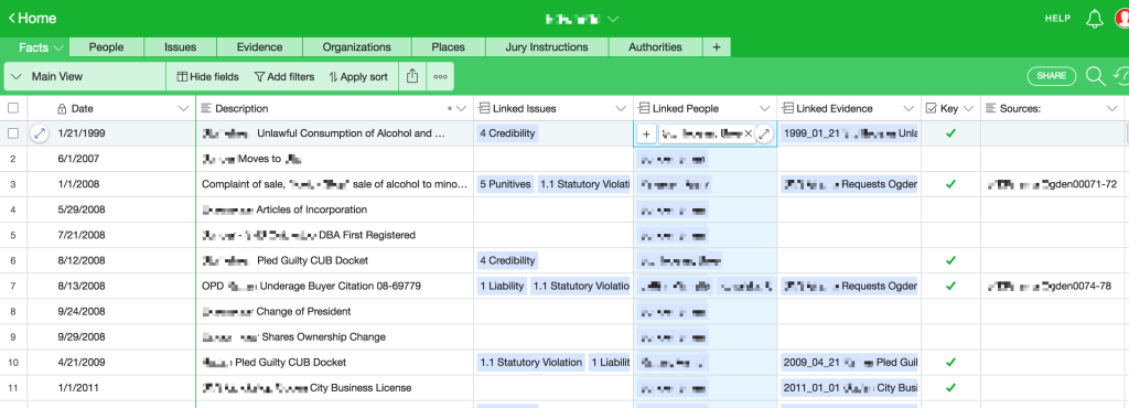
In cases with a multitude of witnesses, facts, and things spread over a timeline and various documents and sources, getting a big picture view becomes essential. On the Windows platform, most lawyers turn to Casemap to pull together meaningful chronologies with the ability to slice and dice by issues, people and source. Casemap provides a ‘spreadsheet’ view for each major list of stuff: people, documents, issues etc. Casemap also made it a breeze to filter each sheet down to just the info you wanted to see or share. For example, filtering all Facts in a chronology down to witness “Joe Smith” and Issue “liability.” Casemap was mostly spreadsheet, but like a weird cross breed with a database. In short, it was a great place to capture data about your case as it evolved and then analyze that data down the road when preparing for a deposition, hearing or trial. On the Mac side, there hasn’t been a really solid tool for doing the same thing until recently.

In the cloud alternatives.

Current pay-to-play services like FactBox ($38/month) and CaseFleet ($34/month) offer close approximations of Casemap through cloud based interfaces. A trial run of FactBox did not coax any money from my wallet as the interface and input of facts carried too much friction and fussing. CaseFleet came not too long after but, in the interim, a cloud based offering called Airtable appeared.

More function, more flexibility, less friction.

Airtable can do everything that FactBox or Casefleet can do, and more. Because Airtable is not locked in to a particular set-up, you get to choose what is what and where it goes. Want to create a chronological Fact sheet with links to sheets for Jury Instructions, Issues, People and Sources? You design it to fit your needs and never find yourself trying to pound nails with a screwdriver.

screenshot_03

Further Airtable is free to use with some limitations that most lawyers will never run up against, but even if you find yourself pushing the limits, pricing starts at $12/month. Airtable, unlike Casemap which is captive on a desktop, is great at collaboration with other people. Finally, Airtable has a really smooth and polished iOS app that allows you to review, edit, add and update your spreadsheet/data tables from an iPad or iPhone. And, surprise surprise, the native app even offers split view if you’re using an iPad Pro.

The only downside is that, because it is a cloud based service, there must be an active internet connection in order to use Airtable. Otherwise, Airtable is an all-around win for lawyers trying to corral a large set of facts, witnesses and issues in a meaningful way.

Outline App Offers Import Utility for Circus Ponies Notebooks

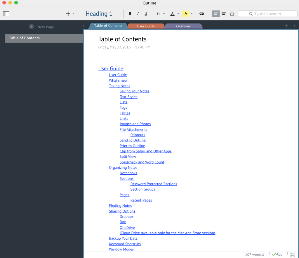
A rather nice little app called Outline is going to release an import utility for Circus Ponies Notebooks. Outline runs on Mac and iPads and, here’s the really nice part, works with Microsoft OneNote. Outline originated as an iOS app that could read-write to Microsoft OneNote. Originally, OneNote was not available on the iPad and this developer put together Outline as a solution for accessing, reading and editing OneNote files. The interface is better and more flexible in some ways than OneNote. Another benefit of Outline over OneNote is the built-in ability to create a hyperlinked hierarchical Table of Contents to all notebook sections and pages.Screen Shot 2016-05-27 at 12.46.59 PM

Finally, Outline offers a very smooth export to PDF where OneNote just seems to make this task difficult.

Of course, Outline also works as a standalone app without using OneNote or Microsoft OneDrive and can sync via Dropbox, iCloud and Box. So, rejoice Notebook users, there is now an opportunity to breathe some life into your beloved notes. Although Outline is not free like OneNote, right now they’re offering a 30% discount for former Circus Ponies Notebook users. This is a great example of an indie developer seeing an opportunity and making the most of it. The importer is currently in beta testing and limited to sign up, but should be released soon.

Copied – Cross Platform Clipboard

Copy On Your iPad, Paste On Your Mac

TranscriptPad (iOS only) is by far and away my favorite method of digesting depositions and other transcribed testimony. But, the heavy lifting often gets done on the Mac side.

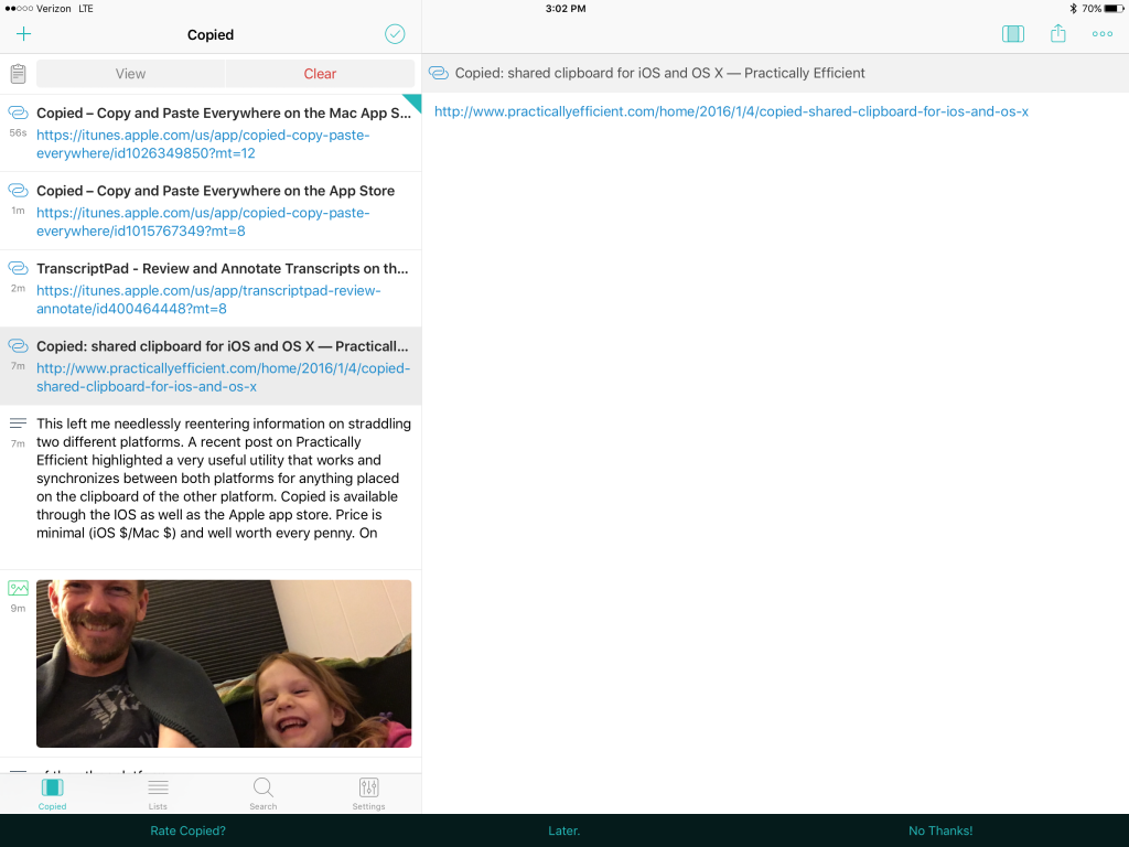
This left me needlessly reentering information, essentially straddling two different platforms. A recent post on Practically Efficient highlighted a very useful utility that works and synchronizes between both platforms for anything placed on the clipboard of the other platform. Copied is available through the IOS as well as the Apple app store. Price is minimal (iOS $1.99 upgrade/Mac $7.99) and well worth every penny. Once installed, anything placed on the clipboard of your iOS device synchronizes via iCloud and becomes Copied Clipboard Manager and Sync iOSimmediately available on any Mac running the software. Additionally, it works the other direction equally well. The utility also incorporates a clipboard manager that stores frequently used snippets of text and any other items that can be copied to the clipboard such as image files and URLs. On the iPad side, Copied includes utilities to transform text, e.g. convert text to upper/lower/title case; remove extra white space; and, find and replace. The ability to quickly format chunks of text on the iPad is particularly useful.

Reduce PDF for Court E-filings

Compressing or reducing PDF  document file size for e-filing with a court

E-filing documents saves a tremendous amount of time. But, getting file sizes right can be a huge headache. Our local e-filing (Utah) limits file size to about 7mb. Our local federal district court limits PDF file size to 10mb. Often times, a file that seems too large to upload as a single document can be compressed or reduced in size. PDF files now come from a variety of sources (clients, opposing counsel, online). We have no control over the settings when creating the original document. Cleaning up the pdf can often reduce the file size and allow filing without splitting up the document into multiple uploads. However, if you think you can compress a 452 page exhibit down to 10mb, you’re probably dreaming. File size remains a function of the analog document. Keep in mind that reducing below 150 dpi using any of these procedures may make small text virtually unreadable and may also effect the ability to convert to usable OCR.

Option #1 – Print and rescan the entire document and scan ‘good’ scan settings, i.e. 150 dpi. Of course, printing and re-scanning the document eliminates many of the efficiencies associated with using electronic versions of the file and wastes a tremendous amount of paper.

Option #2 – Use built in tools for Acrobat, Preview or PDF PenPro. In Preview, select file > export, then choose ‘Quartz Filter’ and ‘Reduce File Size’ from the drop down menus. Using Preview, you’re likely to get a reduction that makes small text difficult to read. PDF PenPro uses the same ‘filter’ as Preview, so you’re not going to get much mileage there. Acrobat has some very powerful file reduction features and granular control under the file > save as (from drop down choose Adobe PDF Files, Optimized). But, if there are any oddities in the document, you can end up with errors coming from who-knows-which-page. If you keep it simple and don’t muck around too much with the settings, you can get a good result. Pro-tip: Create a ‘temp’ folder on your desktop. Copy all exhibits to that folder. Create a batch process for reducing file size and run it on all exhibits after they have been put in the temp folder. Now you can visually see which of those files, even after reduction, is not going to pass the through the e-file size restrictions.

Option #3 – Use a ‘paid-for’ utility from the app store. Right now there are three paid utilities on the Mac App Store, PDF Squeezer ($3.99)(View in Mac App Store) allows you to create your own filter settings and has built in settings which work well, but no batch procession; PDF Compress Expert ($3.99)(View in Mac App Store) a little bit clunky interface with no option to rename documents, but does allow batch processing; PDF Compressor ($29.99)(View in Mac App Store) which also allegedly allows ‘batch processing,’ but is simply too expensive to purchase for review here.

Option #4 – Roll your own or DIY. The ‘paid for’ versions are, at bottom, doing something that any user can do using Automator or AppleScript. There are at least a couple articles out there that teach you how to create your own ‘filter’ on the Mac which will then be accessible in either PDF PenPro or Preview. If you are a hacky type, go roll your own.

For now, it does not appear that there is an easy way to accomplish PDF file size reduction using an iPad.

Jury Selection or ‘Voir Dire’ With an iPad

The maturing iPad and iOS system offer a a number of approaches and apps for use in jury selection, or voir dire. Here’s a review of a relatively new player JuryPad, recent updates to JuryStar and reference to old standbys using a spreadsheet or Bento. One caveat to all of these methods for jury selection: During attorney conducted voir dire, you need someone running the iPad. Attempting to track juror responses and engage in a meaningful give and take with jurors during questioning while simultaneously operating an iPad is just too complicated. [March 15, 2013: Original post omitted coverage of iJuror, now covered below].

JuryPad: iPad App for Jury Selection – Review

JuryPad ($24.99) offers a fairly intuitive and standard iOS interface. Large icons and text make it easy to navigate. JuryPad uses a form input method for gathering juror information during selection process or pre-populating with information prior to selection if you are in a forum that allows access to jury pool names in advance.

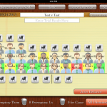
JuryPad lets the user set the rows columns for the pool which is very nice because not all courtrooms have the same number of chairs/rows for holding the pool. The user can then place the jurors in the appropriate pool seat as they reflecting the actual courtroom layout visually. Each juror is represented by an avatar reflecting the sex and race of the individual juror. The inclusion of race in each avatar is a nice feature for Batson issues and giving a quick visual as to what is going on.

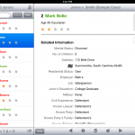
From the courtroom/pool screen, juror detail information can be quickly accessed, and you can complete any unanswered questions and fill in new information as it arises. From the layout screen it is also very easy to strike jurors for cause, as a peremptory by either side or chosen for being a member of the jury. JuryPad accommodates both the ‘seat and strike’ method as well as the method where all questioning is conducted prior to exercising strikes at a bench conference. When seating jurors, once the designated number of necessary jurors has been met, the app pops up a box telling the juror that the selection process is complete.

Visual cues are also included for jurors who have been stricken, but it would be better if the app indicated whether the strike was for cause or which side exercised the strike. Additionally, the ‘custom’ jury selection questions only allow for ‘yes-no’ type questions. This is probably the greatest problem for use in jury selection as open ended questions are the preferred method of eliciting information and opinions from jurors. Additionally, ‘custom’ jury selection question templates are an all or nothing approach. You must select a single set of custom questions to include in each trial. This is unfortunate because there are discreet issues in every trial which lend themselves to template based questioning, but which do not arise in all trials. For example, in a civil tort case, liability might be conceded but there is still a need to question regarding bias in deciding damages. It would be better if individual modules of custom jury selection questions could be added, rather than being forced to pick one long outline.

Last, JuryPad offers the ability to share a single trial with other trial team members. Allowing one team member to create the basic jury selection plan and share it with all others is a smart move and an easy way keep everyone on the same page.

JuryStar: iPad App for Jury Selection

JuryStar ($39.99) has been around longer than JuryPad. The app was originally considered for review on release in December of 2011. Unfortunately, JuryStar used a ‘locked’ jury grid which made the app useless for anything other than the seat and strike method, and even that was questionable considering that jury rows and number of chairs vary from courtroom to courtroom. Several updates from the developer have cured this original limitation, allowing customization of the number of rows and columns for juror pool seating.

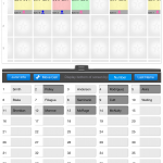
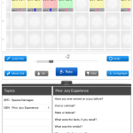
Unlike JuryPad, the app does offer a more flexible load of ‘custom’ voir dire questions. And, individual modules of questions can be loaded in as necessary. JuryStar also uses a ‘slider’ to rate jurors on each area of questioning. The slider compliments and makes possible open ended questions resulting in a more natural  information flow during of voir dire. As information is gathered and jurors rated, the rating summary at the bottom of the jury box changes to reflect the bias of the potential juror. For example, the rating for each area of questioning is displayed in the juror’s box, i.e. an abbreviation for SPD reflecting attitudes about special damages displays a number -5 through +5 and provides a total of all question areas at the bottom. The app also provides a ‘thumbs up’ or ‘thumbs down’ button which changes the color of the box from yellow to red or green. JuryStar gives the lawyer an easy reference to raise strikes for cause and intelligently exercise peremptories.

When exercising strikes, the juror is removed from the pool and placed in a box reflecting peremptory us, them or court stricken. The undo button, however, can be a bit finicky. During use, the undo button only works for the last juror stricken and stops working altogether if you go back to the voir dire screen. A small mistake here could lock you into a pool that does not accurately reflect the strikes and completely derail the setup in JuryStar.

JuryStar gets a bit hung up on the user interface end. The app is a little bit unintuitive and is not iOS standard. Accordingly, there is a bit more of a learning curve with JuryStar. Additionally, JuryStar operates only in portrait mode with no rotation to take advantage of the wider screen in landscape.


Overall, it’s a tough call as to which app is better. JuryPad wins not only on price, but also ease of use. JuryStar wins on feedback, ability to rate jurors during voir dire, and custom question templates but loses ground for it’s interface and undo function. Both would be recommended in the absence of any other approach and both certainly excel over the old scribbled notes on yellow legal pad method.

iJuror: iPad App for Jury Selection

Almost immediately after posting, the developer of iJuror contacted me asking to include that app in this post as well. iJuror ($19.99) provides many of the same features discussed above. But, iJuror offers just about the best over-all summary/visual feedback for rating each juror. Both color and rating can be made to appear, as well as race/sex on each individual juror. The panel can be customized and, best of all, roulette style pickers can be customized as well for quick data entry during selection on important key issues. While offering some benefits over JuryStar and JuryPad, iJuror is somewhat confusing in layout and user-interface. There are two modes for jurors, info and note, yet the notes field is contained in the info mode while none of the detailed demographic and stock info is detailed in the note mode. Additionally, answer space for custom text questions is limited to only about a single sentence. Exercising strikes is relatively easy, and jurors can be placed in the box by drag and drop. The app also offers two additional ‘in-app’ purchases: Juror Scoring ($4.99) and Juror Behavior ($9.99) which expand the capability of the app beyond initial voir dire and selection.

Old Standbys for iPad Jury Selection

There are also a few old standbys for jury selection. The spreadsheet method, which still gets used from time to time, can be easily modified to incorporate a wide variety of issues and circumstances. Numbers on the iPad is a simple, easy to use spreadsheet app and can easily adapt to creating a jury selection template. It’s not that great, but it’ll do in a pinch. There’s also this old but simple Bento approach to jury selection developed here on MacLitigator some years ago. The Bento template is still my preferred method to this day mainly because of the filters built in which allow marking jurors as those to be stricken (either peremptory or for-cause) and then viewed as a final panel. JuryPad and JuryStar, however, are both getting very close to replacing that old Bento approach.
Trial Notebook iPad App – Review

TabLit recently released Trial Notebook ($69.99), an app aimed at making trial preparation easier and more organized for lawyers. The app is a great concept with a good start, but is still a bit rough around the edges and a bit of a learning curve as it took about 2 hours to become familiarized and comfortable working with the app.

Trial Notebook Concept

Any lawyer who has taken more than a few cases to trial is familiar with the concept of a trial notebook. Everything that matters gets placed into the three or two ring binder ‘notebook’ and neatly organized by tabs. Though each lawyer may have their own preferences, the basics in a civil case usually include tabs for: Case Info/Summary; To-Do List; Witnesses; Jury Selection; Jury Instruction; Damages; Exhibits; Pleadings/Orders; Opening; and, Closing.

Making the Trial Notebook Electronic – iPad

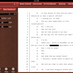
The iPad begs to be used as an electronic version of the trial notebook. Transitioning the trial notebook concept to the tablet platform makes perfect sense. TabLit’s approach takes the standard concept of a trial notebook and adds in the features which would be expected of an electronic version, including word search for the entire notebook. In each ‘tab,’ Trial Notebook allows creation of two main types of page: outline mode or checklist mode. In addition there are two other types of page: a ‘document’ based page and a ‘contacts’ based page. The contacts page will pull info from iOS Contacts. However, it is a bit unpolished in use because it doesn’t allow searching or sorting of iOS contacts, making it virtually impossible to locate the contact you want to add to your trial notebook.

Trial Notebook currently allows Dropbox integration in a ‘download’ only mode with no two-way sync. Documents, including images, PDFs, and Word docs all download fine and are viewable in the app. In fact, Trial Notebook was extremely fast and stable while downloading an entire set of folders and subfolders on a complex litigation case that is just weeks shy of a jury trial, including a prior trip up the appellate court ladder. Many other apps have choked and crashed trying to download data this large from Dropbox. PDFs are not indexed even if they have been OCR’d, only text within the app shows up in searches. The app also includes the ability to track the admission of exhibits, i.e. documents are added from the main library to an ‘Evidence’ or ‘Exhibits’ page and they can be check-boxed (customizable). The developers plan to include two-way Dropbox sync as well as PDF annotation in a not-too-distant release. A premium pay-to-use service is also in the work. The service allows staff to collaborate and add items to a notebook via an online interface. Allowing staff to modify and add items through a web-based interface at the office and sync those directly down to the iPad is a good idea for attorneys on the go.

Perhaps the most interesting feature is the ability to pick an item from anywhere else in the notebook and drop it on the page you are currently viewing. So, in use, you could include a reference to an exhibit within a witness examination outline and the reference would also pull the checkboxes for admitted/denied. At that point in the examination, after moving admission, you could then check the appropriate box and the check would also be reflected on the main exhibit list page. Checklist items (for example for elements of proof) could be used in the same fashion. Additionally, tapping the hyperlink will jump you directly to the referenced item. Unfortunately, there is no plan to allow presentation of the exhibit via an AppleTV or VGA adapter cable. Also, beware: there is no ‘back’ button or recent item navigation so it may make it hard to find your way back to the examination outline in the middle of trial.

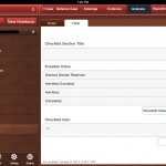
Text formatting on the outline pages is a bit odd, with icons that are pixelated and reminiscent of Word ’95. Additionally, there are many spots in the app that, from a user interface standpoint, are just plain silly. For example, when creating a New Checklist type page, you are presented with the option to save or discard the new page via an ‘X’ button or save via a ‘floppy disc’ icon…. Really. A floppy disc icon on an iPad.

Picking nits aside, the app really is a great concept and the developers are very responsive. As the app matures and further develops these 1.0 bumps will, no doubt, be resolved. If you don’t already have a system in place for an electronic trial notebook (such as Circus Ponies Notebook; OmniOutliner; PDF based or otherwise), TabLit’s Trial Notebook could provide you a useful starting point.