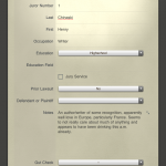
Timestream Case Analysis Tool & Review

Case Analysis Using Timestream

Well designed and smooth interface. A nice approach to viewing cases from a chronological perspective and virtually no learning curve. Features a bit limited on the 1.0 release given for review and few quirks. Lawyers looking for a different view of their case facts might find a place for Timestream in their toolkit.

Getting Info Into Timestream

Putting events into Timestream is fairly straightforward, but with a few quirks. Events consist of date, time and description. Files can also be associated with an event via the Finder or drag and drop. Tags can be added to events. Tags are a bit quirky. If you have ever used a tagging system with software before (Evernote, DEVONthink etc.) you probably expect to be able to just start typing a tag in the Tags field and, if the tag already exists it will autocomplete. If the tag does not exist, hitting return will add a new tag once you finish typing the word. Timestream requires each tag to be entered using a mouse click on a “+” button and selecting the tag. This must be done for each tag added to an event.

Filtering & Searching Case Info

Searching can be done on the fly by selecting a tag, using word search across titles and descriptions or a combination of both. Searches on words can be single word, boolean and include at least rudimentary wild card support, e.g. surger* will return all results for surgery and surgeries. Saved searches can also be created using either or both, but with the added benefit that more than one tag at a time may be used for the search. Selection of more than one tag requires that ALL of those tags be present. I.E. it is an ‘and’ type search and cannot be changed to an either/or search for multiple tags. Searching only occurs on information entered in Timestream and does not extend to attached files, so it won’t search through any of the attached PDF text.

Case Analysis Mac Software Timestream

Summary

At this point, the software is well developed, does not seem buggy and provides a useful tool if you aren’t already doing case analysis in a manner that allows you to see your case facts chronologically. A few more features would be nice, including the ability to see events in a list or spreadsheet view as opposed to being stuck with the timeline view. It would also be good if the app searched the text inside attached files which contain searchable text. Additionally, import and export functions would be much appreciated and perhaps help with data entry as well. Finally, it would be great if all of your hard work could be shown in a ‘presentation’ view format or at least be exportable for use by other time lining software such as BeeDocs 3D Timeline. Although Timestream bills itself as capable of converting a timeline into a ‘multi-modal, multi-media presentation tool that runs in any web browser,’ that feature is not currently available in the testing program provided for review.

Timestream is cross-platform and there are plans for iOS apps as well. Pricing is not yet available.

Jury Selection or ‘Voir Dire’ With an iPad

The maturing iPad and iOS system offer a a number of approaches and apps for use in jury selection, or voir dire. Here’s a review of a relatively new player JuryPad, recent updates to JuryStar and reference to old standbys using a spreadsheet or Bento. One caveat to all of these methods for jury selection: During attorney conducted voir dire, you need someone running the iPad. Attempting to track juror responses and engage in a meaningful give and take with jurors during questioning while simultaneously operating an iPad is just too complicated. [March 15, 2013: Original post omitted coverage of iJuror, now covered below].

JuryPad: iPad App for Jury Selection – Review

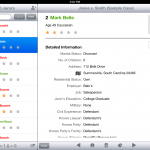
JuryPad ($24.99) offers a fairly intuitive and standard iOS interface. Large icons and text make it easy to navigate. JuryPad uses a form input method for gathering juror information during selection process or pre-populating with information prior to selection if you are in a forum that allows access to jury pool names in advance.

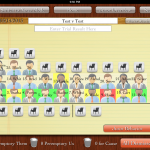
JuryPad lets the user set the rows columns for the pool which is very nice because not all courtrooms have the same number of chairs/rows for holding the pool. The user can then place the jurors in the appropriate pool seat as they reflecting the actual courtroom layout visually. Each juror is represented by an avatar reflecting the sex and race of the individual juror. The inclusion of race in each avatar is a nice feature for Batson issues and giving a quick visual as to what is going on.

From the courtroom/pool screen, juror detail information can be quickly accessed, and you can complete any unanswered questions and fill in new information as it arises. From the layout screen it is also very easy to strike jurors for cause, as a peremptory by either side or chosen for being a member of the jury. JuryPad accommodates both the ‘seat and strike’ method as well as the method where all questioning is conducted prior to exercising strikes at a bench conference. When seating jurors, once the designated number of necessary jurors has been met, the app pops up a box telling the juror that the selection process is complete.

Visual cues are also included for jurors who have been stricken, but it would be better if the app indicated whether the strike was for cause or which side exercised the strike. Additionally, the ‘custom’ jury selection questions only allow for ‘yes-no’ type questions. This is probably the greatest problem for use in jury selection as open ended questions are the preferred method of eliciting information and opinions from jurors. Additionally, ‘custom’ jury selection question templates are an all or nothing approach. You must select a single set of custom questions to include in each trial. This is unfortunate because there are discreet issues in every trial which lend themselves to template based questioning, but which do not arise in all trials. For example, in a civil tort case, liability might be conceded but there is still a need to question regarding bias in deciding damages. It would be better if individual modules of custom jury selection questions could be added, rather than being forced to pick one long outline.

Last, JuryPad offers the ability to share a single trial with other trial team members. Allowing one team member to create the basic jury selection plan and share it with all others is a smart move and an easy way keep everyone on the same page.

JuryStar: iPad App for Jury Selection

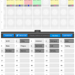
JuryStar ($39.99) has been around longer than JuryPad. The app was originally considered for review on release in December of 2011. Unfortunately, JuryStar used a ‘locked’ jury grid which made the app useless for anything other than the seat and strike method, and even that was questionable considering that jury rows and number of chairs vary from courtroom to courtroom. Several updates from the developer have cured this original limitation, allowing customization of the number of rows and columns for juror pool seating.

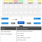
Unlike JuryPad, the app does offer a more flexible load of ‘custom’ voir dire questions. And, individual modules of questions can be loaded in as necessary. JuryStar also uses a ‘slider’ to rate jurors on each area of questioning. The slider compliments and makes possible open ended questions resulting in a more natural  information flow during of voir dire. As information is gathered and jurors rated, the rating summary at the bottom of the jury box changes to reflect the bias of the potential juror. For example, the rating for each area of questioning is displayed in the juror’s box, i.e. an abbreviation for SPD reflecting attitudes about special damages displays a number -5 through +5 and provides a total of all question areas at the bottom. The app also provides a ‘thumbs up’ or ‘thumbs down’ button which changes the color of the box from yellow to red or green. JuryStar gives the lawyer an easy reference to raise strikes for cause and intelligently exercise peremptories.

When exercising strikes, the juror is removed from the pool and placed in a box reflecting peremptory us, them or court stricken. The undo button, however, can be a bit finicky. During use, the undo button only works for the last juror stricken and stops working altogether if you go back to the voir dire screen. A small mistake here could lock you into a pool that does not accurately reflect the strikes and completely derail the setup in JuryStar.

JuryStar gets a bit hung up on the user interface end. The app is a little bit unintuitive and is not iOS standard. Accordingly, there is a bit more of a learning curve with JuryStar. Additionally, JuryStar operates only in portrait mode with no rotation to take advantage of the wider screen in landscape.


Overall, it’s a tough call as to which app is better. JuryPad wins not only on price, but also ease of use. JuryStar wins on feedback, ability to rate jurors during voir dire, and custom question templates but loses ground for it’s interface and undo function. Both would be recommended in the absence of any other approach and both certainly excel over the old scribbled notes on yellow legal pad method.

iJuror: iPad App for Jury Selection

Almost immediately after posting, the developer of iJuror contacted me asking to include that app in this post as well. iJuror ($19.99) provides many of the same features discussed above. But, iJuror offers just about the best over-all summary/visual feedback for rating each juror. Both color and rating can be made to appear, as well as race/sex on each individual juror. The panel can be customized and, best of all, roulette style pickers can be customized as well for quick data entry during selection on important key issues. While offering some benefits over JuryStar and JuryPad, iJuror is somewhat confusing in layout and user-interface. There are two modes for jurors, info and note, yet the notes field is contained in the info mode while none of the detailed demographic and stock info is detailed in the note mode. Additionally, answer space for custom text questions is limited to only about a single sentence. Exercising strikes is relatively easy, and jurors can be placed in the box by drag and drop. The app also offers two additional ‘in-app’ purchases: Juror Scoring ($4.99) and Juror Behavior ($9.99) which expand the capability of the app beyond initial voir dire and selection.

Old Standbys for iPad Jury Selection

There are also a few old standbys for jury selection. The spreadsheet method, which still gets used from time to time, can be easily modified to incorporate a wide variety of issues and circumstances. Numbers on the iPad is a simple, easy to use spreadsheet app and can easily adapt to creating a jury selection template. It’s not that great, but it’ll do in a pinch. There’s also this old but simple Bento approach to jury selection developed here on MacLitigator some years ago. The Bento template is still my preferred method to this day mainly because of the filters built in which allow marking jurors as those to be stricken (either peremptory or for-cause) and then viewed as a final panel. JuryPad and JuryStar, however, are both getting very close to replacing that old Bento approach.

Trial Notebook iPad App – Review

TabLit recently released Trial Notebook ($69.99), an app aimed at making trial preparation easier and more organized for lawyers. The app is a great concept with a good start, but is still a bit rough around the edges and a bit of a learning curve as it took about 2 hours to become familiarized and comfortable working with the app.

Trial Notebook Concept

Any lawyer who has taken more than a few cases to trial is familiar with the concept of a trial notebook. Everything that matters gets placed into the three or two ring binder ‘notebook’ and neatly organized by tabs. Though each lawyer may have their own preferences, the basics in a civil case usually include tabs for: Case Info/Summary; To-Do List; Witnesses; Jury Selection; Jury Instruction; Damages; Exhibits; Pleadings/Orders; Opening; and, Closing.

Making the Trial Notebook Electronic – iPad

The iPad begs to be used as an electronic version of the trial notebook. Transitioning the trial notebook concept to the tablet platform makes perfect sense. TabLit’s approach takes the standard concept of a trial notebook and adds in the features which would be expected of an electronic version, including word search for the entire notebook. In each ‘tab,’ Trial Notebook allows creation of two main types of page: outline mode or checklist mode. In addition there are two other types of page: a ‘document’ based page and a ‘contacts’ based page. The contacts page will pull info from iOS Contacts. However, it is a bit unpolished in use because it doesn’t allow searching or sorting of iOS contacts, making it virtually impossible to locate the contact you want to add to your trial notebook.

Trial Notebook currently allows Dropbox integration in a ‘download’ only mode with no two-way sync. Documents, including images, PDFs, and Word docs all download fine and are viewable in the app. In fact, Trial Notebook was extremely fast and stable while downloading an entire set of folders and subfolders on a complex litigation case that is just weeks shy of a jury trial, including a prior trip up the appellate court ladder. Many other apps have choked and crashed trying to download data this large from Dropbox. PDFs are not indexed even if they have been OCR’d, only text within the app shows up in searches. The app also includes the ability to track the admission of exhibits, i.e. documents are added from the main library to an ‘Evidence’ or ‘Exhibits’ page and they can be check-boxed (customizable). The developers plan to include two-way Dropbox sync as well as PDF annotation in a not-too-distant release. A premium pay-to-use service is also in the work. The service allows staff to collaborate and add items to a notebook via an online interface. Allowing staff to modify and add items through a web-based interface at the office and sync those directly down to the iPad is a good idea for attorneys on the go.

Perhaps the most interesting feature is the ability to pick an item from anywhere else in the notebook and drop it on the page you are currently viewing. So, in use, you could include a reference to an exhibit within a witness examination outline and the reference would also pull the checkboxes for admitted/denied. At that point in the examination, after moving admission, you could then check the appropriate box and the check would also be reflected on the main exhibit list page. Checklist items (for example for elements of proof) could be used in the same fashion. Additionally, tapping the hyperlink will jump you directly to the referenced item. Unfortunately, there is no plan to allow presentation of the exhibit via an AppleTV or VGA adapter cable. Also, beware: there is no ‘back’ button or recent item navigation so it may make it hard to find your way back to the examination outline in the middle of trial.

Text formatting on the outline pages is a bit odd, with icons that are pixelated and reminiscent of Word ’95. Additionally, there are many spots in the app that, from a user interface standpoint, are just plain silly. For example, when creating a New Checklist type page, you are presented with the option to save or discard the new page via an ‘X’ button or save via a ‘floppy disc’ icon…. Really. A floppy disc icon on an iPad.

Picking nits aside, the app really is a great concept and the developers are very responsive. As the app matures and further develops these 1.0 bumps will, no doubt, be resolved. If you don’t already have a system in place for an electronic trial notebook (such as Circus Ponies Notebook; OmniOutliner; PDF based or otherwise), TabLit’s Trial Notebook could provide you a useful starting point.


Fantastical for iPhone

Calendar Alternative for iPhone

Fantastical has been released for iPhone. Long available for the Mac, Fantastical for the iPhone is exactly, precisely, what a calendar should look like and how a calendar should function on your iPhone. Limited time initial release pricing is only $1.99 and so so worth it.

Essential Mac Apps

The best part about Macs is the ease of upgrading to new hardware. In the old Windows days, an upgrade to new hardware meant hours lost reinstalling applications, hunting down serial number and praying to the software licensing gods that there wouldn’t be some crazy limitation preventing you from installing software you already purchased on your shiny new computer. With a Mac, the ability to easily transfer an entire user environment (apps, data, settings) from the old hardware is dead simple.

But, recently, I came into possession of an iMac. Not having worked from a desktop in a very long time, I decided to do a clean install of OS X and then track which apps I was forced to install first.

The First Apps Installed On A Clean Mac

Notably, you can get quite a bit of work down without installing anything. OS X’s built in Mail, Calendar, Preview (reads PDFs) and Address Book get you up to speed fairly quickly, and for free. But, it also didn’t take long to start needing other stuff to get the job done quickly, and more comfortably. So, from first installed to last, here’s the list of essential Mac OS X apps used in my daily routine.

June 29, 2012: Update - I was just over at MILO and read New Jersey estate planning lawyer Victor Medina’s response listing his essential Mac apps. He included Dropbox and Alfred (or LaunchBar). I actually use both of those and, in fact, installed those early on but they so seamlessly integrate into my workflow that I forgot to include them on the list altogether.

1. BusyCal – Sync with just about anything and list view.
2. Moom – Getting windows set just right on the screen.
3. 1Password – Surprised this didn’t come in first, really. Tracks all your important passwords AND credit cards, driver’s licenses etc.
4. TextExpander – Too many joys to explain, from audience specific signature lines in emails to shortcuts for legal citations.
5. OmniFocus – When you get tired of spinning your wheels and going ten different directions at once, put some direction to your energy (just don’t put it all into micromanaging your ToDo list, a.k.a. know when to stop organizing what you need to do and start doing stuff.)
6. Pages – Because, eventually, you’ll need to write something with substance and formatted in an eye pleasing manner.
7. DEVONthink Pro Office – Heavy lifting, digging deep case and issue analysis.
8. Skitch – Screenshots, but importantly, screenshot filenames which tell you where the screenshot came from, including the page number of the PDF you were looking at when you took the screenshot.
9. Circus Ponies NoteBook – Collecting and building notes, depo outlines, thoughts, themes and exhibits, so that it can all get thrown together into a Trial Notebook.
10. Default Folder X – OS X’s continuing shortcoming? Finder. Fix it with this nice little utility that makes the finder truly useful, including the ability to add OpenMeta tags to files as you save them.
11. DEVONtechnologies Free Word Service – Ever need to delete bunch of line endings or change an ALL CAPS line to small caps? Go get this free utility to quickly and effortlessly manipulate text.
12. DEVONsphere – $4.99 on the app store. Get it and play with it. It can be a bit of processor hog, so set it on a weekly index schedule, preferably on a day you are not working.
13. OmniOutliner Pro – The old standby outliner. It is a great way to organize depo outlines and the standout columns feature allows you to sort by date, or do spreadsheet style calculations.
14. Parallels/WinXP (TextMap, WordPerfect) – Bleh. Occasionally you just get sucked back in… think of it as going into the storage room in the basement to pull some old file out of archives and then relish your return to the sunlit corner office of Mac OS X.

Do you have a ‘must install’ app not listed above? Tell us about it in the comments, including the ‘why.’

App Review: rulebook – Electronic Legal Rules on the iPad

Remember that old Rules of Evidence book you have laying around with the stickies hanging off the side, notes scribbled in the margins and highlighting on important language? A new app developer has put out an app that gets oh-so-close to recreating that book on your iPad. Best of all, when the rule gets updated, all your annotations get transferred to the new rule.

Annotating Rules of Evidence, Civil Procedure etc. in ‘rulebook.’

The app allows you to add bookmarks, highlights (limited to a single color throughout your rule sets) and notes. All of these items ‘stick’ whenever the rule gets re-written or updated. Notes, highlights and bookmarks can be seen in a summary pane so you can quickly jump to those sections. A hand-annotated Federal Rules of Evidence hardbound copy will eventually become obsolete through re-writes of the rules, forcing you to hand transfer your notes over to a new book. rulebook attempts to correct that problem by carrying over your annotations to the new rule set.

And, it almost gets there. Recently the Utah Rules of Appellate procedure received an update. Some language was altered, some language was deleted and moved to a new section. Testing indicated that, where the language was merely altered, the annotations stuck. But, with the deleted and moved language, the annotations themselves were lost, although the Bookmark/Note/Highlight still shows in the summary pane.

User Interface on rulebook

It is both a bright future, and still a bit quirky when it comes to the interface. Rulebook uses the standard iPad interface with items in the left pane and content on the right. The unique feature is the ability to open multiple rules in a separate ‘window’ in the right pane. This works for cross-referenced rules as well. So, reading Utah R. Evid. 608’s cross-reference to Utah R. Evid. 403, tapping on the hyperlinked ‘Rule 403’ opens a new pane, allowing you to read the reference without losing your place.

There are, however, a few quirks. Quickly jumping back and forth between rules, closing rule sets and opening new rules led to a freeze on one of the windows. Also, while the navigation is unique, it can feel a bit odd at times. A tabbed interface alá Safari/Firefox might be more intuitive for displaying the cross-referenced rule.

Finally, the app does include a decent search feature which allows searching for a Phrase, All Words or Any Word, no boolean yet. The nice part about the search feature is that the results pane pulls up individual sub-sections of a single rule, allowing you to quickly get to the relevant section in a long rule as opposed to hunting around. The search pane results also tell you the number of hits in each result. Unfortunately, there is no next-previous search hit function and you are forced to return to the search pane to jump around.

Right now, rule sets are only available for the Federal courts, California, Delaware, Illinois, Massachusetts, New Nersey, New York, Texas and Utah. The Federal Rules of Evidence are free so you can get a feel for the app and decide if it’s something that fits for you. Other rule sets are very reasonably priced at at .99¢ each. If you are lucky enough to live in one of the currently covered jurisdictions, rulebook is well worth picking up and using. The developer is a practicing attorney and uses his own app on a daily basis. Speaking with him recently, there are some really big plans behind the app and things in the works. rulebook should get much better with time.


iPad Note Taking Apps Showdown

The ability to take handwritten notes on an iPad seems like a no-brainer. But, which app to choose? Here’s a showdown of the five most frequently mentioned apps for handwritten notes on the iPad, from least liked to best bet. [UPDATE: Vote for your favorite iPad handwritten note taking app.]
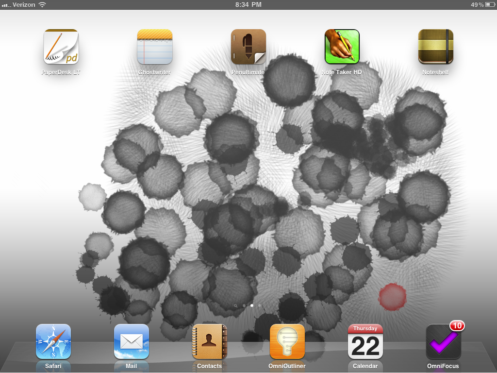
PaperDesk

PaperDesk comes (unlike any of the other apps) in a free ‘lite’ version on the app store, so it may be worth a try to see if it fits your needs. Unfortunately, inking is not very smooth. There is a nice bookmarking feature, and a nice to-do feature including the ability to review all to-dos from multiple notebooks on the home screen. However, the to-do’s do not sync to a particular page in a notebook.

Exporting to PDF requires connecting to iTunes. There is no Evernote integration.

Paperdesk does have the ability to export directly to Google docs. It also includes the ability to use typewritten notes. Typewritten notes, unfortunately, do not wrap around hand written notes and ink almost seems to be a secondary input choice. The keyboard has a nice quick access toolbar for tabs, bullets and math symbols.

Palm protection, the ability to keep your wrist or palm from creating extraneous and unwanted marks on the paper, is weak. The icons and general layout are somewhat goofy and not at all iOS like. There are no discrete settings or preferences. Photos can be imported either from the photo library or the camera.

PaperDesk also includes the ability to record voice notes. However, the keyboard obscures the record button, making it difficult to begin and end recording. Sounds are actually linked to the typewritten words making it quick to jump to any particular point of the recording. For example if you typed out “four score and seven years ago” while recording, and then clicked on the word years, the audio would begin replaying whatever was spoken or recorded at that particular point when the word “years” was typed. This is similar to the functionality contained in other programs such as Soundnote for the iPad, and also replicates, to some extent, the functionality of having a LiveScribe pen. Unfortunately, the recording does not track handwritten notes and tracks only typewritten notes.

GhostWriter Notes.

Ghostwriter ($4.99) notes allows you to take notes either with pen or by typing on your iPad. The interface is much better than that of PaperDesk. There are a number of different papers which can be used and custom papers can be made from anything contained within the iPads photo album. PDFs can also be imported for annotation and markup, a great feature for filling out things such as standardized intake forms. Interface is relatively clean and straightforward, iOS like.

Export options are plentiful, including the ability to export through e-mail, Dropbox, Evernote, directly to a PDF viewer, by printing wirelessly to printers capable of communicating with iOS, as well as sending the note page to the iPad photos album. GhostWriter allows the user to insert blank pages into a notebook, and reorder the pages as you see fit. Each page is given the default description of the current date, but each page can also be renamed to a custom page name. There are, of course, a variety of pens, pencils and highlighters for use within the application. Unlike PaperDesk, there is no audio recording with GhostWriter. GhostWriter employs a zoomed handwriting feature. This allows the user to write with much greater detail than would normally be possible using a stylus or finger on a blank page. However, the ink contained within the zoom box is somewhat pixelated and difficult to read.

Penultimate.

Penultimate ($1.99) is perhaps the most iOS like of any of the applications. It is brutal in its simplicity which, depending on your view, is either the highest selling point or the biggest drawback. Penultimate has outstanding pen to paper feel, with the ink flowing smoothly across the page. It incorporates very, very good palm protection. Photos can be imported from either the iPad’s photo album or directly from the camera. Paper is limited to 3 styles, although additional styles are available for both free and via in-app purchase.

The main drawbacks to Penultimate are limited export opportunities. Entire notebooks or individual pages can only be exported as PDF files or as native Penultimate files and only through e-mail. Individual pages can be saved into the iPad photo album or printed via iOS capable printers. Overall, Penultimate is a beautiful app, accurately recreating the simplicity and presentation of a pen and paper notebook.

Note Taker HD.

Note Taker HD ($4.99) is perhaps the deepest of all these applications. The best of these features include the ability to select, cut and paste handwritten text, the ability to tag, flag and mark favorites for individual notes. Also, Note Taker HD can directly import PDFs and then mark them up. As with GhostWriter, this can be very handy for creating forms you want to fill out. Of course, to some extent, this inevitably results in duplicate data entry, the bane of the computing world. Note Taker HD also incorporates a zoom feature for creating handwritten notes. Again, this allows a great deal of detail and precision when writing in the Zoom box that is reflected on the full page.

The handwriting this passable, but not quite as smooth as Penultimate. Additionally, Note Taker HD lacks the ability to directly connect to Evernote. Finally, note taker HD is a somewhat complex piece of software is a trade-off for the depth of features. Although the layout is nice and presentable, it can be a bit offputting and somewhat counterintuitive at times as it diverges from standard IOS interface.

Noteshelf.

Noteshelf ($4.99) has truly amazing handwriting/pen and ink response. It also incorporates a zoom feature which allows, again, precision handwriting. The ink on the page is comparable to Penultimate. Noteshelf allows for palm protection to avoid inadvertent inking on the paper. The interface and layout is very iOS like, very intuitive, and customizable for lefty versus righty. There is a direct Evernote export. As well as Dropbox, iTunes, e-mail, iPad photo album, and print to iOS capable printers. Export format can be set to go as either individual images for each note page (which is the best way to export to Evernote as the handwriting will be recognized and then searchable) or as multipage PDFs. Page navigation is very nice and intuitive with a thumbnail drop-down for each page. Individual pages can be rearranged and reordered and individual pages can be moved/copied between different notebooks. Downsides to Noteshelf include the inability to import PDFs for annotating. Also, custom papers are, as with Ghostwriter and Penultimate, a separate in-app purchase for additional money. Photos can be imported directly from either the camera or the iPad’s photo album.

The big winner.

It’s a close call between Noteshelf and Note Taker HD. Note Taker HD has some superb features and is well worth considering if you need to fill out for right on top of an markup individual PDFs. However, if you want great inking ability, excellent export options, and ease-of-use note shelf is the way to go. If, on the other hand, you want to recreate as closely as possible plain ole’ pen and paper, go with Penultimate.

This is not an all inclusive list of note taking apps which use ink, just a review of those most frequently mentioned. Noterize sorta gets you there, and is free, but the inking isn’t that great although the app does do audio recording. Notes Plus is a nice effort, allows mixed typing and handwriting, as well as recording audio. But, the ink feel is a bit jerky, the export options and paper are both very limited as well.

A word about styluses (styli?).

Writing on the iPad with your finger will quickly become unbearable and unworkable. If you want to take handwritten notes, you will need a stylus. The Pogo ($10.98 Amazon) is workable, but has a spongy tip on it. The Kuel H10 ($12.99 Amazon) has an excellent tip which is nice and as precise as can be with a capacitive touchscreen such as the iPad has. Unfortunately, the Kuel 10 is also a stubby little bugger. I resorted to modeling mine by pulling the rubber grip off a regular pen and also extending the length by sticking an extension on the Kuel 10. Update: Received a Jot stylus from Adonit ($19.99) last night… by far and away the best stylus out there due to the length. Because it has a ‘hard’ tip, as opposed to the rubber and sponge of others, it does tend to make a tapping sound on the glass as you write. But, the Jot is a full-length, well balanced device. You ‘can’ make your own free Jot disc-style stylus if you have the time and DIY attitude (web page link, YouTube link). Why would you want to make your own? Because these things (stylii) get lost, because you want to use an old-well balanced pen you have lying around, because you’re cheap, because you’re a tech-head pioneer and slide rulers, pocket protectors and thick rimmed glasses have all gone out of style.
On the Bleeding Edge

Back in the dark ages (prior to the widespread availability of the ‘personal’ computer), my father worked in a corporate environment. There was always a push for the most up-to-date technology as a tool which could speed work, improve accuracy and even take out the garbage if you were willing to just spend the time writing code. Unfortunately, due to limitations of hardware at the time, that kind of coding eventually only produced a program that would flash “take out the garbage”on the screen at a given time and day.

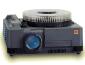
One particularly impressive piece of technology available to staff: a “presentation” device. This device consisted of a series of rackmounted slide projectors which could be operated so as to give the effect of “transitions” between slides.

This amazing slide projector had cutting edge features such as a 1300 lm lamp; forward and reverse control of slides; an RS-232 serial connector; random slide access via remote control or computer; a built-in dissolve feature (0 to 10 seconds); and it weighed in at a feathery light 26 pounds. All this for a paltry $1,560 (lens not included). Surprisingly, the manufacturer did not include the most important feature in the press release materials: an amazing capacity to consistently overheat and crap out 5 min. into a 20 min. presentation.

The more things change, the more they stay the same. Recently, in the middle of trial, about to begin a cross exam of a witness, the TrialPad app, when reconnected to the cable at the podium, refused to display anything other than mirror mode.

The revolutionary software, this secret weapon, this huge advantage over my worthy but technologically handicapped adversary, was now not only worthless, but also a potential scuttling of my whole boat. Technology rigorously follows Murphy’s law: anything that can go wrong will go wrong.

Belt and Suspenders

In addition to having spare batteries for the remote, a spare bulb for the projector, a spare laptop/iPad in case it craps out, and your presentation on a spare USB drive you must have, more than any of these, a plan ‘B.’

Plan ‘B.’ The cross exam depended on a few key documents and prior testimony. Time to go old school. At every trial, the important exhibits (there should usually only be five and absolutely no more than ten of these) should be blown up and placed on foam board. Now, here’s the trick: get those blow ups laminated. This allows you to draw, write and highlight directly on the blow up with dry erase markers which can then be later erased. Next, always have a hardcopy of your exam outlines contained in your trial notebook. Last, always have hardcopies of the depositions. With these items in hand, you never need to worry that technology will fail you. You only need to question whether the time and money involved in technology are worth the the effort.

Note: The fatal bug in TrialPad appeared in a previous version and has since been corrected.

TrialPad – Dedicated Presentation App for the iPad

The recently released TrialPad for iPad is a good start on what trial presentation for the iPad can be, but doesn’t yet meet expectations associated with its high price.

Anything You Can Do, I Can Do …

At its heart, TrialPad is a PDF viewer and organization tool. There are many PDF tools for the iPad, including iAnnotate. Both TrialPad and iAnnotate allow presentation of a PDF through a projector. Both TrialPad and iAnnotate allow markups to be displayed on the screen. Both TrialPad and iAnnotate allow the user to pinch-to-zoom the onscreen document. Both TrialPad and iAnnotate allow the presentation screen to be turned on and off.

iAnnotate, however, has quite a few more tricks than TrialPad. iAnnotate will search through an entire PDF file or group of files for any word. TrialPad only searches the ‘name’ of a document.

iAnnotate will pull in documents from Dropbox. Trial pad relies on the ‘seven easy steps’ kludge iTunes file transfer feature. The developers note that Dropbox support is ‘in the works.’

iAnnotate allows a ‘tabbed’ interface wherein you can project an exhibit or impeachment testimony while privately viewing your direct/cross examination outline on the iPad. TrialPad eschews tabs limiting the display to a single item. iAnnotate includes a large number of built in ‘stamps,’ such as arrows and callouts, and allows you to pick different highlighter and annotation colors. TrialPad sticks to a red pen and yellow highlighter.

TrialPad costs $89. iAnnotate costs $9.99.

Not A Replacement for Sanction, Trial Director etc.

Responding to these criticisms the developers claim that, rather than iAnnotate, a “fair comparison would be TrialPad against full featured desktop presentation software such as Sanction or TrialDirector.” Not entirely accurate. First, TrialPad has nowhere near the features of dedicated laptop trial presentation software. Second, by that standard, we could also compare iAnnotate against dedicated laptop presentation software. TrialPad would still lose in that comparison.

A Little Bit Buggy

TrialPad is also still very much a 1.0 release. TrialPad can annotate a document on the iPad while the projector remains blanked. During testing, the annotation appeared on the projector despite the screen being blanked. Additionally, PDFs sometimes appeared extremely pixelated on the iPad while rendering crisply on a projector. This made it very difficult to annotate with any degree of precision.

A Few Nice Standout Features

There are some nice aspects to TrialPad. First, it is fairly straightforward and easy to use, once one gets beyond the iTunes sync. Once loaded, it could be handed to a lawyer who lacks much technical know how and they could use it without difficulty. Second, TrialPad allows an exhibit or single page of an exhibit to be marked up ‘saved’ for later use. This feature, with nothing comparable in iAnnotate, could be very handy for having witnesses markup a document using the annotation tools, then saving it as a separate exhibit to be admitted later. Finally, TrialPad also allows the user to rotate an image on the iPad itself, another feature unavailable in iAnnotate. If, for some reason, an image were scanned or loaded incorrectly, simply tapping the rotate button would bring it into the correct alignment for presentation.
Final Verdict

Simply put, by setting the price at a steep $89 the developers ignore the Apps ecosystem and economy. Not even Omni Group charge more than $39 for their highly polished, feature rich iPad app OmniFocus which syncs to the iPad without any iTunes kludge needed. Further, Filemaker’s Bento is only $9.99, Pages, Numbers and Keynote are also only $9.99. In short, TrialPad is a solid start and a potential winner, but in the end offers too little for too much money.

Holiday Gift: Bento Template For Jury Selection

Happy Holidays from MacLitigator… Here’s your gift, a Bento template for jury selection.

While prepping for a jury trial recently, it became apparent that we needed a better way to track responses, information, decisions to strike, strikes for cause, peremptories etc. during jury selction, a.k.a. voir dire. Bento seemed a perfect fit for this task.

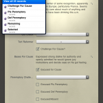
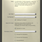
The template is designed to work on an iPad and, accordingly, incorporates as many checkboxes and choice lists as possible so that there is minimal distraction during jury selection.  Jurors are sorted by juror number, and there are smart collections which filter as follows: Challenge for Cause; Plaintiff’s Peremptory (exercised); Defendant’s Peremptory (exercised); Remaining; Selected.  Several of the fields do allow text entry, such as the Notes, but other fields are intended to give you a quick fill such as ‘gut check,’ and ‘tort reformer’ drop down choice lists which allow a quick ranking of the potential juror.

The template works great on the iPad version of Bento with one exception, smart collections based on a ‘choice list’ field do not transfer over.  Accordingly, none of the smart collections in this template use the choice field to preserve functionality on the iPad. Enjoy and, if you come up with suggestions or modifications, please post in the comments.

Bento on the iPad is $4.99, although having the desktop version certainly is worth the cost and syncs with the iPad wirelessly.

Speaking of ‘jury work,’ there is an interesting iPad app out there that allows you to track the reactions of people who get seated as jurors during the course of the trial.  It is called JuryTracker and, if you were so inclined, you could track juror reactions as the trial progresses.  JuryTracker costs $9.99.  Also available as a commercial iPad only app is iJuror, a stand alone app for the iPad that assists in the jury selection process. iJuror is also $9.99.